The Changing Logos of Steph Welch
My first website
When I was at University studying Digital Media Design, sometime between 2013 and 2016, I built my first website.
I created it using HTML and CSS, and it was very simple.
To compliment my website, I designed a very basic logo, and this is the first of many logo and brand concepts used for my personal (now business) website.
Since this first iteration of my online presence, my design skills and knowledge have evolved, and so has my logo.
In this post, I will talk you through some of the milestones in my logo development journey. From a simple squiggle to combining fonts to make a custom type. Let’s take a look at the changing logos of the Steph Welch brand.
Logo 01
This was the first logo I created for my personal brand. Or at least the first one that was published online.
At the time, the purpose of my website was to satisfy coursework briefs set at Uni. Once built, we were encouraged to use it for blogging to document our projects.
The course was varied, and we experimented with many different digital media-related things, including 3D animation. This logo was used in animation projects to create videos I could insert into my blog.
I set up a YouTube channel, and I used the logo to create a short animation used in the branding of the videos. The primary colour I displayed this logo in was orange.
Looking at this now, I realise it’s way too simple and hard to see on a smaller scale due to the thin lines.
Logo 02
As I worked on my graduate project in my final year of University, we had to revisit our personal brand.
This was in preparation for promoting ourselves and upgrading our web presence and social media so we could find work.
I created this new logo, again very simple.
I changed my primary colour from orange to pink, using this aesthetic across my final graduate piece, website, business cards etc.
Logo 03
After graduating, I wasn’t sure about my career path, and it was a while before I got a job vaguely relevant to my degree. Having the blog I’d set up at uni and then converted into a personal blog helped me to get an SEO job in a marketing agency.
Whilst in this job, I only remember doing a little on my website as my focus was work. But towards the end of working there, I considered starting my own business.
As I moved to Spain and then quit my job to continue travelling, I set about rebranding my website with a focus on getting clients to pay for my travels. I didn’t know what I was going to do for those clients, but I felt a change of brand was needed regardless.
I think my lack of direction is evident in the lack of thought and effort that went into this logo. It was just a random font I liked in Canva. This remained my logo while I was travelling and building my business.
Logo 04
In September 2020, after returning from my travels and amid a pandemic, I started a professional development in Graphic Design course at Brighton MET College.
At the beginning of the course, I think in preparation for it, I created this logo design. I don't remember the thought behind it. I do remember wanting to create a logo icon that I could use for a more interesting favicon or on any merch I might create, etc.
I don't love it. I’m not really sure what it represents or why there is a circle above the S on its side. Luckily, the course was a great design knowledge refresher and motivation to improve this design further.
Logo 05
The final project for the Graphic Design course was to create our personal brand identity and associated materials, CV, etc.
I enjoy branding, so I was excited to make another logo. After much more experimentation, with much more thought and design knowledge behind it, I created this logo.
This was more than just a case of taking an existing font and spelling out my name. I combined two font styles and played with the spacing to create something unique.
It was around this time I was really starting to get into digital art. I had intended to sell my art online, and I bought stickers with this logo to put on my packaging for prints.
Logo 06
After the course, I fell down a new rabbit hole on social media.
I started watching more artists using traditional mediums and found myself drawn to creating for fun and making art rather than having the pressure of designing for a client.
I think I just had imposter syndrome, convincing myself that despite completing the course I still was not good enough to design and earn money from it. Being an artist felt safer as I could create what I wanted, not what a client wanted.
This led me to change my logo again.
My previous logo was too graphic designy. Whereas something softer like this script font felt more personal and more artistic. It feels more like an artist's signature than a designer’s logo.
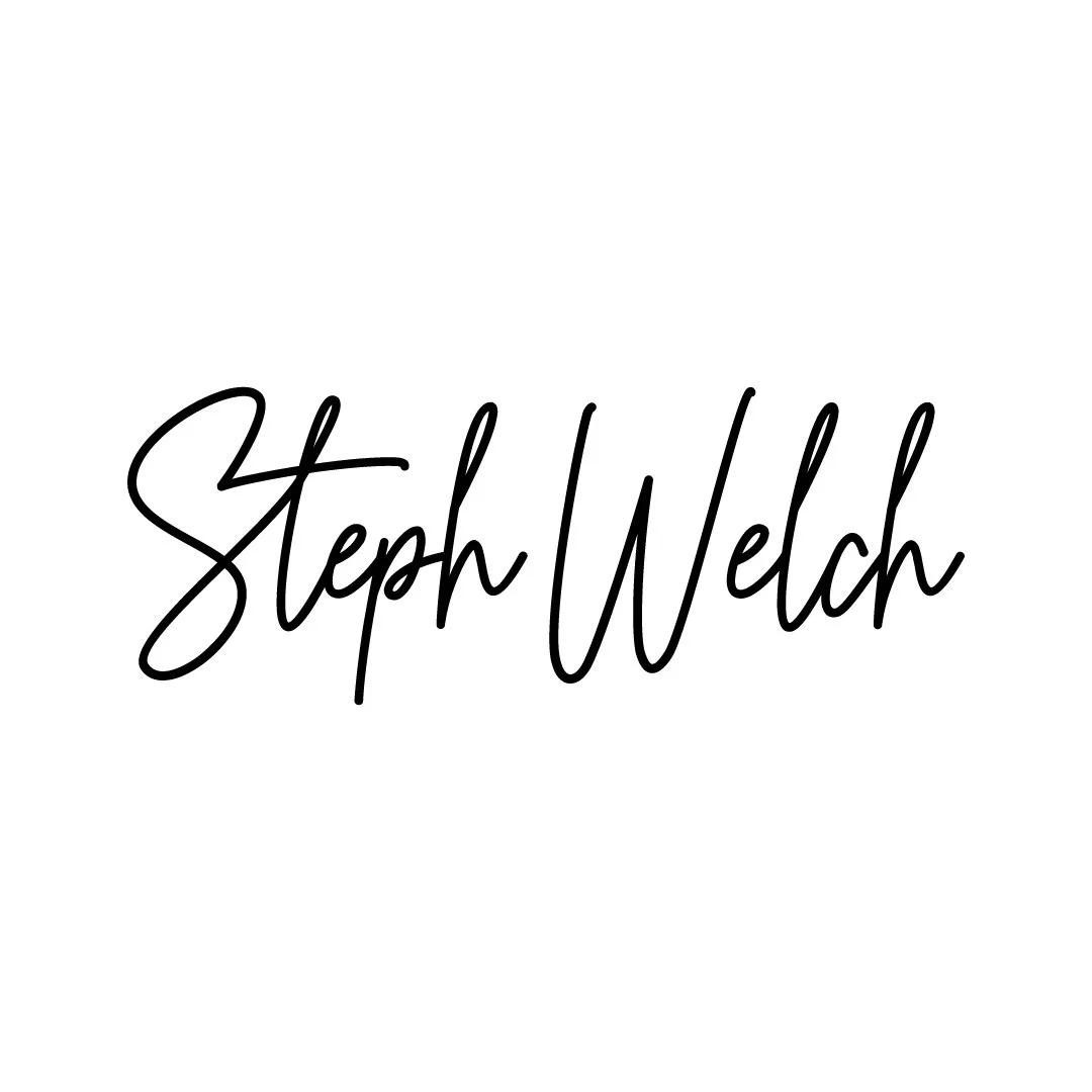
Logo 07
Since starting my business, I have never had clarity on what I should offer. I have flip-flopped between offering web design, social media, video editing, SEO and graphic design services. All under the Steph Welch brand. My content has involved personal stories, travel anecdotes and tips, blogging and content creation advice and design-related content.
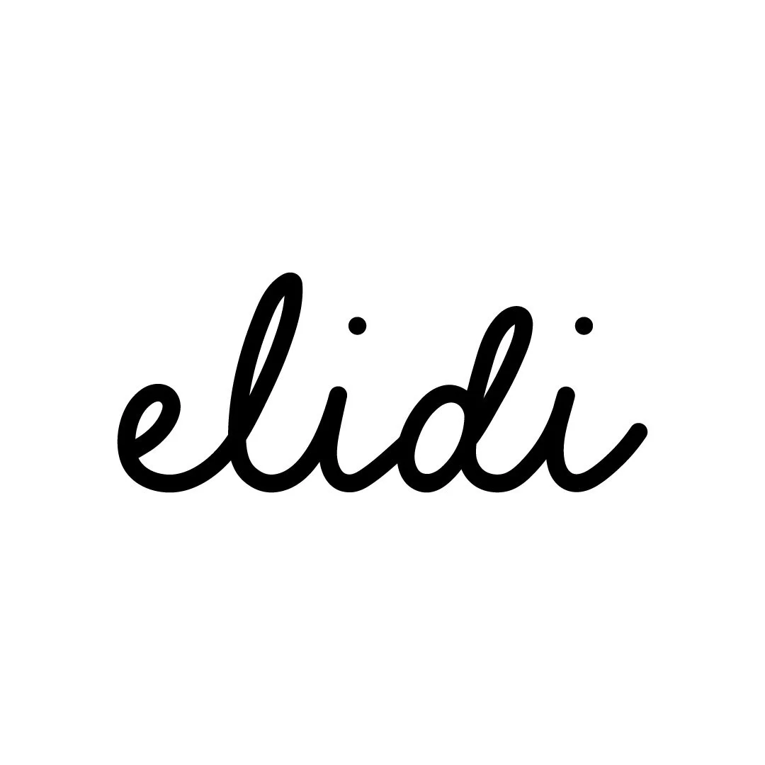
I felt that my "Steph Welch" brand had taken far too many twists and turns over the years and wanted to start fresh with a clear art and design focus for my website. This was when I renamed my business to Elidi Studio. It allowed me to do anything creative under the umbrella of this new brand, and it should all make sense.
I wanted to create a future-proof logo design for this brand that could be used on anything, from clothing labels to product stickers, as well as digital content, should I expand the business in any direction. I managed to create that with this logo. This logo has a version with the word studio beneath, but this works well as a stand-alone mark. I created this font based on an existing front but refined it using Adobe Fresco on my iPad. I like how this turned out. It has a hand-drawn look but still feels professional and is easy to read.
Logo 08
Once I had set up the new elidi studio brand, I feared I had made a mistake.
I missed having that personal element to my brand and wanted to get back into blogging about personal topics, not just design-related content.
I started making YouTube videos in the Art niche, which were gaining traction.
I debated whether to separate my business into a personal and professional brand.
My personal brand covers lifestyle and art topics, and my professional brand is the elidi studio business.
I did this for a while, and this was the logo I created for the new version of my personal brand. I like how it’s one font with two different weights to distinguish the two words. It’s a pretty simple design but a really nice typeface.
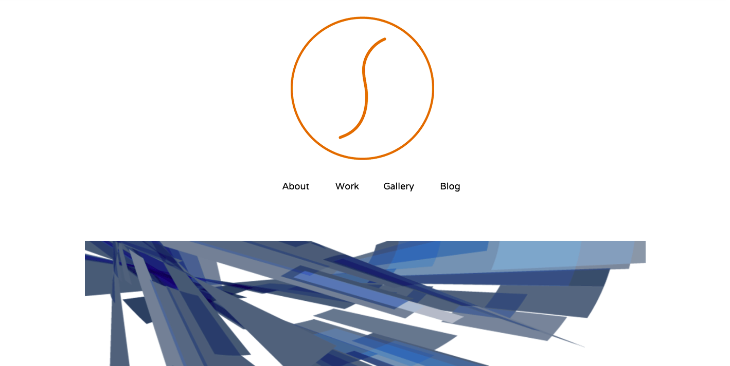
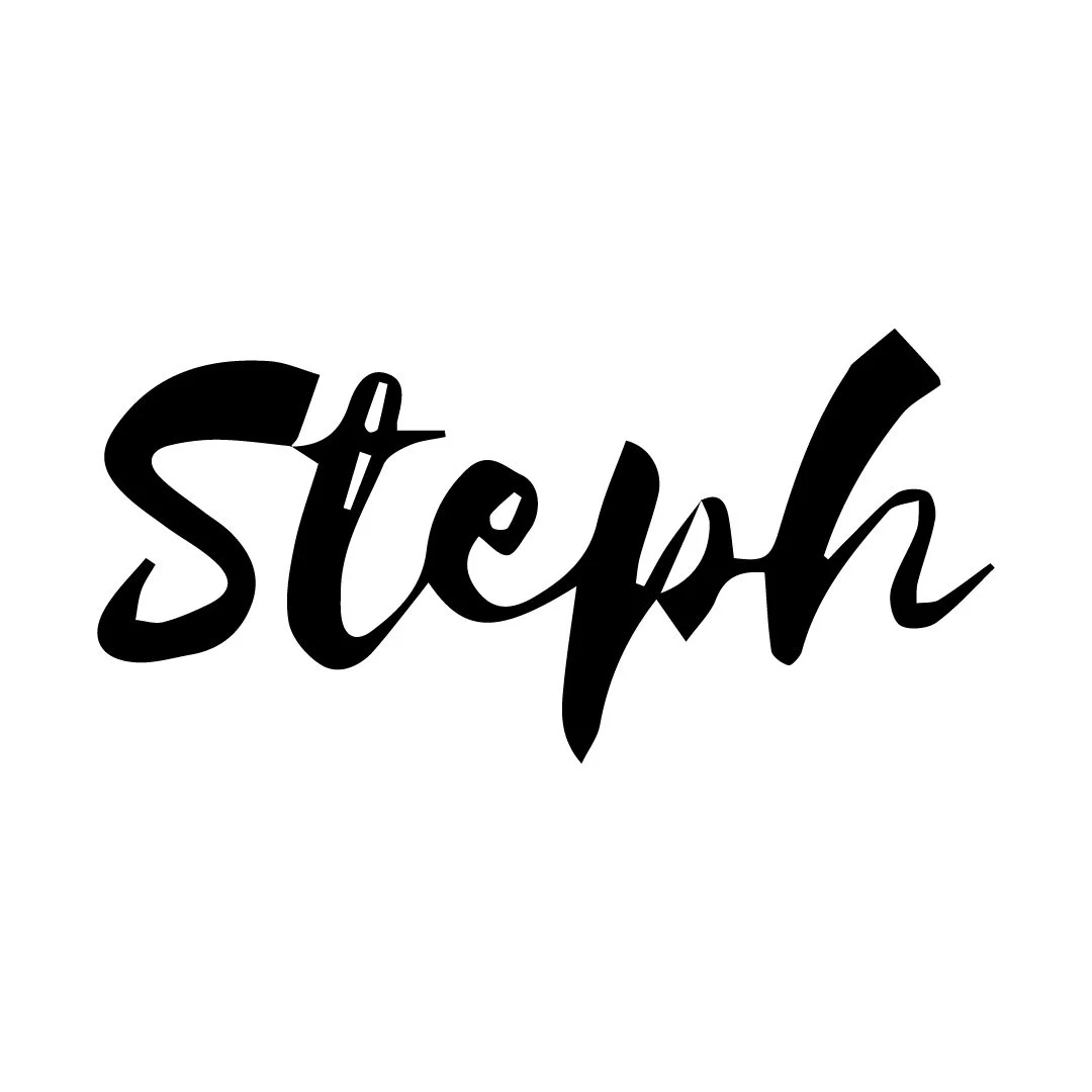
My Brand Today
Maintaining two brands became a LOT, and with a lack of a clear direction for both, I had another change of heart. I changed my business name, including my bank account etc, all back to “Steph Welch”. I decided to embrace the fact that I’m multi-passionate, and my business and brand will forever be evolving and probably won’t look the same from one year to the next.
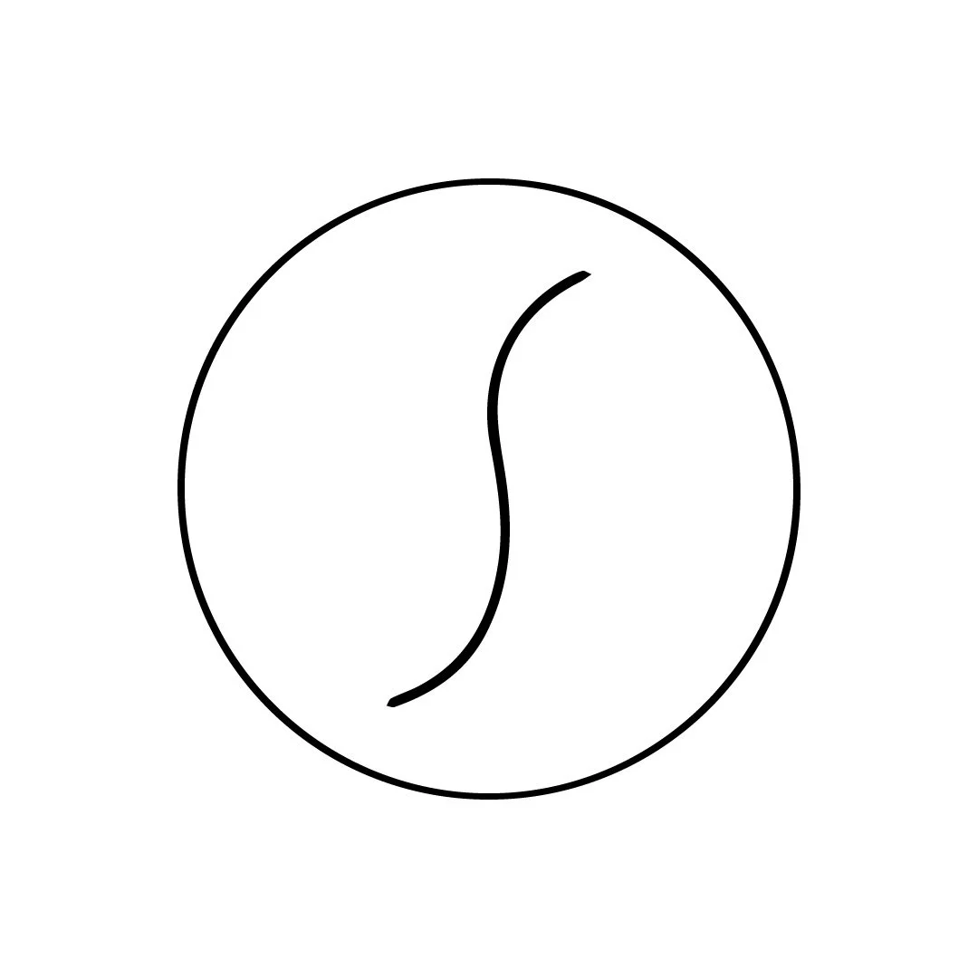
Looking back at the logos I have created for myself over the years, I can see real improvement. I really loved the Elidi logo I had created for when my business had a name change, and I wanted to somehow incorporate this style into a new logo. I wanted this new logo to be versatile, to suit my brand, whether I was offering creative services or selling creative work. The above logo achieves this.
I created this font by combining different letter forms from a couple of fonts and then redrawing the entire logo myself using my mix-match font as a guide. I spent a lot of time getting the spacing and angles how I wanted them. I like how this font is an evolution of logo 06 which I had created for the ‘artist’ version of my brand. It has a much nicer, more streamlined shape with a thicker weight to it. This logo seems to be a hybrid between logo 06 and logo 07. It’s a slightly chunkier, more professional looking signature style logo.
I’m really proud of this logo, and I think it will work well whatever I decide to offer in my business. It will look great on a piece of my artwork, as a watermark on photos, on a professional business card I might give out as a designer, or anything else I decide to become. It is the perfect mix of professional and personal, and it’s very me!